Add Line Chart
Navigate to Dashboards
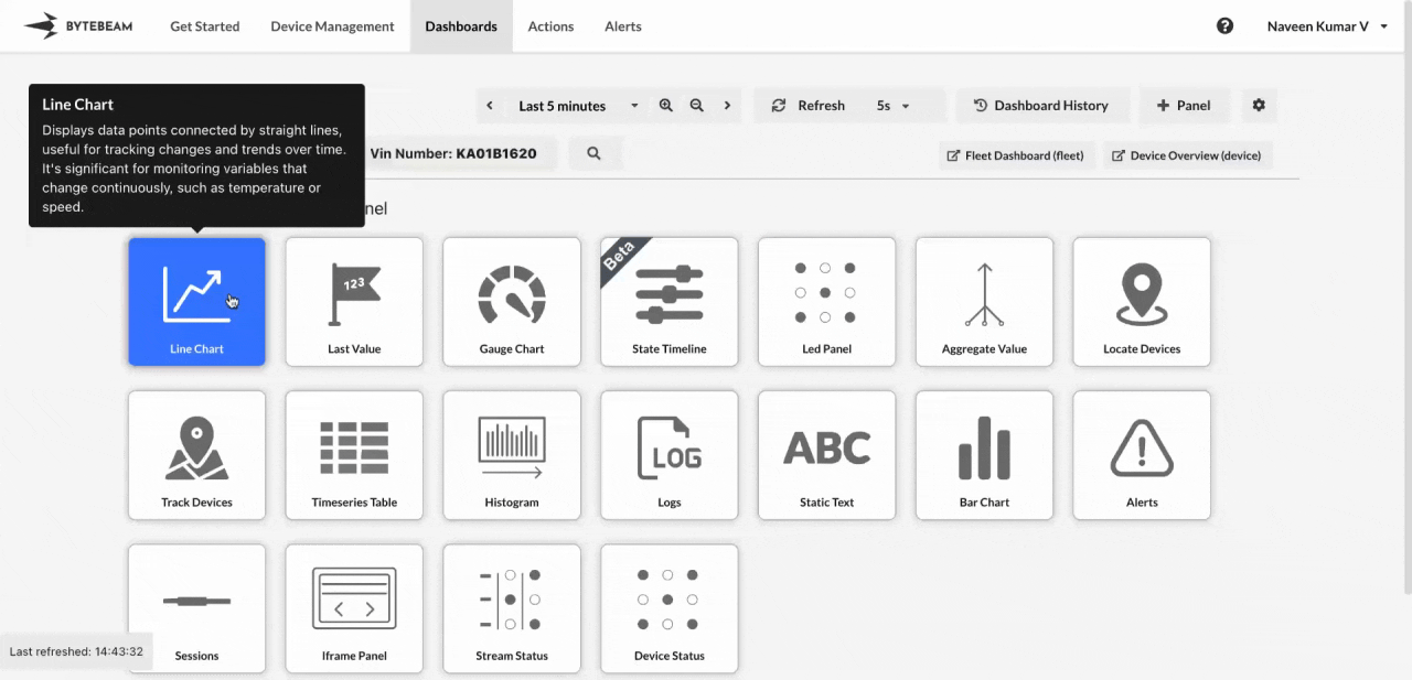
Go to the Dashboards tab, select the desired dashboard, and click on the + Panel button to create a new panel.
Customize Chart Settings
Add a title for the chart and select the data source for the panel.
You can:
- Add multiple data sources (streams) in the same panel.
- Add filter conditions and group the data by particular columns using the Advanced option.
- Use an alternate axis on the right if multiple streams are selected.
Customize Graph Settings
Switch to the View tab to personalize the appearance of your line chart. Options include:
- Area Chart: Shade the area under the line to emphasize volume or magnitude over time.
- Connect Null Values: Connect missing data points with lines for better continuity in trends.
- Show Points or Markers and Adjusting Line Width: Highlight individual data points and control the line thickness for clarity.
- Upper and Lower Thresholds: Add horizontal lines to indicate critical thresholds, such as limits or targets.
- Custom Y-Axis Range: Focus on specific data ranges by adjusting the Y-axis scale.
Customize Axis Settings
Use the Axis Settings section in the View tab to fine-tune the X and Y axes for better data clarity and visualization:
- Grid Options: Enable or disable grid lines for both X and Y axes to improve graph readability.
- Label Options: Customize axis labels to provide clear context for your data.
- Units Options: Set appropriate units for the axes to ensure the values are well-understood.
- Auto Margin for Y-Axis: Adjust margins automatically to handle graph shrinking and maintain proper scaling.